


Follow us for more exclusive content

An Investor's Guide on How to Read Stock Charts

Investing can seem super complicated, especially if you’ve seen some of the crazy-looking technical analysis stock charts out there. Thankfully, stock charts are actually pretty easy to follow if you understand what you’re looking at. Once you know how to read stock charts, you can then start learning about how to use them as part of your investment strategy.
So what are stock charts and how do you read them? From opening and closing prices of stock traded in the overall market to the broader stock market index, here are a few examples to help you learn.
Learning to read a stock chart doesn't take much time. But gaining confidence in your ability may do. However, you can begin investing now by working with a trusted financial advisor and investment expert.
Key Takeaways
- Stock charts are graphical representations of a stock's price and volume movements over a certain period of time, providing a visual way for investors to track a stock's performance and identify trends, patterns, and potential buying or selling opportunities.
- Stock charts come in various forms, including line charts, bar charts, candlestick charts, and point and figure charts.
- Stock charts are essential tools for investors to analyze a stock's performance, identify potential buying or selling opportunities, and manage risk.
- Understanding key components like price, volume, and time is crucial for interpreting stock charts.
- A stock chart can tell investors about historical price trends, trading volume, support and resistance levels, and technical indicators such as moving averages and relative strength index (RSI).
Disclaimer
The contents of this article are for educational purposes only. They are not intended to be a source of professional financial advice. You will find experts on financial planning, financial management, and real estate here. More on disclaimers here.
What are Stock Charts?

Stock charts are graphical representations of a stock's price and volume movements over a certain period of time. They provide a visual way for investors to track a stock's performance and identify trends, patterns, and potential buying or selling opportunities.
Stock charts typically display the stock prices on the y-axis and the time period on the x-axis, with each point on the chart representing the stock's closing price for that day or time period.
Stock charts come in various forms, including line charts, bar charts, candlestick charts, and point and figure charts. Each type of chart presents stock price movement and volume movement in a different way, and investors can choose the type of chart that best suits their needs and preferences. Stock charts are an essential tool for investors to analyze a stock's performance, identify potential buying or selling opportunities, and manage risk.
How Do You Read Stock Charts?

By learning how to read stock charts, you'll be better equipped to make informed decisions about buying and selling stocks.
Is It Easy to Read Stock Charts?
Reading stock charts may seem overwhelming at first, but with some practice and basic knowledge, it can become easier over time. While there are many different types of stock charts, most share similar elements such as price, volume, and time. Understanding these key components and how they relate to each other is the key to interpreting stock charts.
What Does a Stock Chart Tell You?
A stock chart provides a visual representation of a stock's historical performance over a certain period of time. It includes information about the stock's price, volume, and other indicators that can help investors make informed decisions about buying or selling the stock.
Here are some of the key things that a stock chart can tell you:
- Historical price trends
A stock chart shows the stock's price over a period of time, allowing investors to see trends and patterns in the stock's performance. This information can be used to help predict future price movements.
- Trading volume
A stock chart also shows the volume of shares traded during a given period. High trading volume can indicate increased interest in a stock, while low trading volume can indicate that investors are less interested in the stock.
- Support and resistance levels
Stock charts can also help investors identify key support and resistance levels, which are price levels where the stock has historically found support or faced resistance.
- Technical indicators
Many stock charts also include technical indicators, such as moving averages and relative strength index (RSI), which can help investors identify trends and potential buy or sell signals.
Overall, a stock chart provides a wealth of information about a stock's historical performance and can be a valuable tool for investors looking to make informed decisions about buying or selling stocks.
A Basic Stock Line Chart
Below is a basic stock line chart from CNBC for Facebook (FB) stock.
First, you’ll see some important data above the chart. Going from left to right, “155.631” was the current price of one share of FB at the time I took a screenshot of the chart, and “+1.58” is the increase in price of the stock since the stock started trading the morning of that day.
Meanwhile, “+1.03%” is the price increase in percentage over the same time period.
Volume is how many shares of FB stock have traded throughout the day so far. The 52-week range (“149.02 – 218.62”) is the highest and lowest price for an FB share in the past 52 weeks. Below this data, you’ll see many time periods you can choose from including 1D (one day), 5D (five days), 1M (one month), and so on. Clicking on each of these will change the date ranges on the chart.
Once you get to the chart, you’ll see that it’s fairly easy to read.
The blue line represents the price of one share of FB stock over the time period shown on the X axis. The prices are shown on the Y axis.
If you hover your mouse over the chart, a box will pop up that displays further information about that day’s activity for the stock. This includes the opening price, closing price, and highest and lowest prices during the time period quoted. It will also show you the volume for the period.
Another way to visualize the volume traded each day is the tiny bars that extend up from the X axis on the bottom of the chart. The higher the bar, the more shares that were traded during that time period. You can hover over each bar to see the exact volume traded during that period.
What are the 4 types of stock charts?

The four main types of stock charts are:
- Line chart
A line chart is the simplest type of stock chart, showing the stock's closing prices over a period of time as a continuous line. It is useful for showing long-term trends but does not provide as much detail as other types of charts.
- Bar chart
A bar chart displays the stock's opening, high, low, and closing prices for each day as vertical bars. This provides more detail than a line chart and is helpful for analyzing trends over shorter periods of time.
- Candlestick chart
A candlestick chart also displays the stock's opening, high, low, and closing prices, but uses candlestick-shaped symbols to represent the data. This type of chart provides more information than a bar chart, such as the stock's momentum and whether it closed higher or lower than it opened.
- Area chart
An area chart shows the stock's price movements as a series of colored areas, with each area representing a period of time. This type of chart can be useful for visualizing the magnitude of changes in the stock's price over time.
Each type of stock chart has its own strengths and weaknesses, and the best chart to use will depend on the specific information an investor is looking to analyze.
Stock Chart Construction – Lines, Bars, Candlesticks
Let's examine examples of 2 major types of stock charts.
A Bar Chart
Below is a bar chart for Amazon (AMZN) from BarChart.
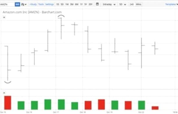
Bar charts look a bit more confusing than line charts, but they’re still fairly simple to read. There are two parts to the above chart. The first is the top portion of the bar chart that shows the price of the stock. The second is the bottom portion, which shows the volume of the stock. Each bar represents one time period, which in this case is 240 minutes.
First, the top chart shows the movement of price over each 240 minute period for each bar. Over the entire chart, the lowest price period will be highlighted with an arc under that bar and the highest price period will be highlighted with an arc over the bar. In this example, the first bar is the lowest price period and has an arc under it.
Each individual line bar shows the range of the stock pricing during that period. The top of the bar is the highest price during the period and the bottom of the bar is the lowest price during that period. The tick-mark on the left side of the bar shows the price at the start of the period, while the one on the right side of the bar shows the price at the end of the period.
The second part of the chart is the volume at the bottom. The height of the bar shows how many shares were traded over that time period. If the bar is green, the stock price went up over the period. If the bar is red, the stock price went down during the period.
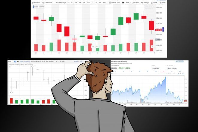
A Candlestick Chart
Here is a candlestick chart for Alphabet Inc, which is the company that runs Google (GOOG), from Yahoo Finance.
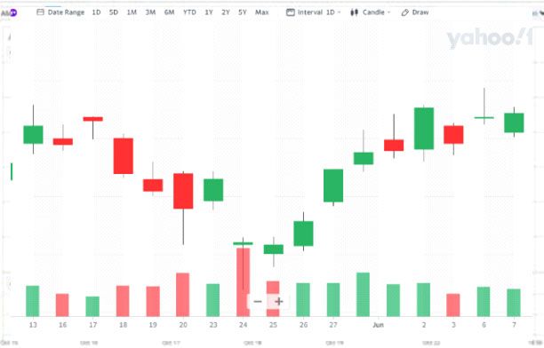
Candlestick charts also look confusing at first, but they’re easy to read once you understand them.
The top set of lines and bars are the candlesticks and represent the price of a stock. If the filled-in bar of the candlestick is green, the price went up during the period shown. If it’s red, the price decreased during the period.
For the green bars, the bottom of the filled-in bar is the opening price for that period and the top of the filled-in bar is the closing price for the period. But for the red bars, the top of the filled-in bar is the opening price for that period and the bottom of the filled-in bar is the closing price.
The ends of the skinny lines above and below the filled-in bar represent the highest and lowest price during the period, respectively. The bars on the bottom represent volume and work exactly the same as the volume bars in bar charts.
Why Do Stock Charts Matter?

If you’re buying and selling individual stocks, these charts can be very important. Charts allow you to see trends, which can help you make decisions about buying or selling an individual stock.
Stock market expert and speaker Tela Holcomb says that stock charts help her make trades. “I use stock charts to identify support and resistance levels (when a stock could potentially stop going up or stop going down) and when a stock is potentially headed up or down in price,” she says. “I do this by using certain indicators that measure whether a stock is trending up or down.”
Holcomb adds that stock charts are also helpful in finding historical trends that are likely to repeat each year. “For instance, AMZN has a history of going up just before Black Friday,” she says. “I discovered this by looking at stock charts for the days and weeks leading up to Black Friday to see that it repeats this trend majority of the time (i.e. eight out of 10 years).”
While this all sounds complicated, it’s just like learning how to read stock charts. Once you understand support and resistance levels and the other indicators Tela talks about, it’s easier to understand how charts can make a big difference in your stock trading.
Stock Chart Patterns for Traders

Stock chart patterns are visual representations of a stock's price movements over a certain period of time. Traders use these patterns to identify potential buying and selling opportunities, and to make informed decisions about when to enter or exit a trade.
Here are some of the most common stock chart patterns traders use:
Head and Shoulders: This pattern is identified by three peaks, with the middle peak being higher than the other two. It indicates a potential trend reversal, with a bearish outlook.
Cup and Handle: This pattern looks like a cup with a handle on the right side, and is a bullish signal indicating a possible trend reversal.
Double Top/Bottom: This pattern occurs when the stock price hits a resistance or support level twice, indicating a potential trend reversal.
Triangle: This pattern is formed when the stock's price movements create a triangle shape, with converging support and resistance levels. It can indicate a potential breakout in either direction.
Flag and Pennant: These patterns are formed by a sharp price movement, followed by a period of consolidation in the form of a flag or pennant shape. They indicate a potential continuation of the trend in the direction of the original price movement.
Traders use these patterns in conjunction with other technical indicators, such as moving averages and relative strength index (RSI), to make informed decisions about when to enter or exit a trade.
While chart patterns can be helpful in identifying potential opportunities, it's important to note that they are not always accurate and should be used in conjunction with other analysis and risk management strategies.
How Investors Use Stock Charts

Investors use stock charts to gain insights into a stock's historical performance, and to make informed decisions about buying or selling stocks. Here are some of the ways investors use stock charts:
- Analyzing Trends
Investors can use stock charts to identify long-term trends in a stock's price movements. This information can be used to determine whether a stock is in an uptrend, downtrend or range-bound, and to make informed decisions about buying or selling the stock based on this information.
- Analyzing Patterns
Investors also use stock charts to identify patterns that may indicate potential opportunities to buy or sell a stock. These patterns can include head and shoulders, cup and handle, double tops or bottoms, and triangles, among others.
- Identifying Support and Resistance Levels
Stock charts can also be used to identify key support and resistance levels for a stock. Support levels are price levels where buyers have historically entered the market and prevented the price from falling further. Resistance levels, on the other hand, are price levels where sellers have historically entered the market and prevented the price from rising further.
- Analyzing Technical Indicators
Investors also use stock charts to analyze technical indicators, such as moving averages and relative strength index (RSI). These indicators can help investors identify potential buying or selling signals and to make more informed decisions about when to enter or exit a trade.
- Managing Risk Finally, investors use stock charts to manage risk by setting stop-loss orders at key support and resistance levels. A stop-loss order is an order placed with a broker to buy or sell a stock once it reaches a certain price level, and can help investors limit their losses if the stock price moves against them.
Overall, stock charts are an essential tool for investors to analyze a stock's performance, identify potential buying or selling opportunities, and manage risk. While it does require some knowledge and practice, learning how to read and use stock charts can help investors make more informed decisions about buying and selling stocks.
Does Reading Stock Charts Work: Can It Make You a Better Investor?

Reading stock charts can certainly make you a better investor. It allows you to identify trends and patterns in a stock's performance, which can be used to make informed decisions about buying or selling the stock.
Reading stock charts can help you become a better investor as it helps you identify trends, spot opportunities, manage risk, and analyze technical indicators.
Overall, reading stock charts can provide valuable insights into a stock's historical performance, helping investors make informed decisions about buying or selling stocks. While working with an investment expert cannot be overstated, learning how to read stock charts can definitely make you a better investor.
Bay Street Capital Holdings

Bay Street Capital Holdings is a financial company that provides independent investment advisory, wealth management, and financial planning services to enhance total assets and income while efficiently managing overall risk and volatility.
The company's founder, William Huston, has been recognized as one of Investopedia's Top 100 Financial Advisors for 2022. Bay Street Capital Holdings was established to foster diversity and aid emerging fund managers and entrepreneurs.
Additionally, the firm was a finalist in the Asset Manager for Corporate Social Responsibility (CSR) category, out of more than 900 firms in the US.
Sources
https://www.theforage.com/blog/skills/read-stock-charts
https://www.nerdwallet.com/article/investing/how-to-interpret-stock-charts-and-data
https://www.kotaksecurities.com/share-market/what-are-stock-charts/
https://tickertape.tdameritrade.com/trading/stock-chart-types-16237